
New website, same craft: how I designed pattdesign.es
Let me introduce myself, tell you what I do and show you from the inside how I designed and built the new Patrick Uribe Studio website.
 Patrick Uribe · Granada · · 6 min read
Hi, I'm Patrick Uribe. I'm a designer based in Granada and I run my own studio, Patrick Uribe Studio. I was born in Brussels, French is my mother tongue and, before setting up the studio, I worked at marketing agencies, where I learned that good design only works when it has a clear direction.
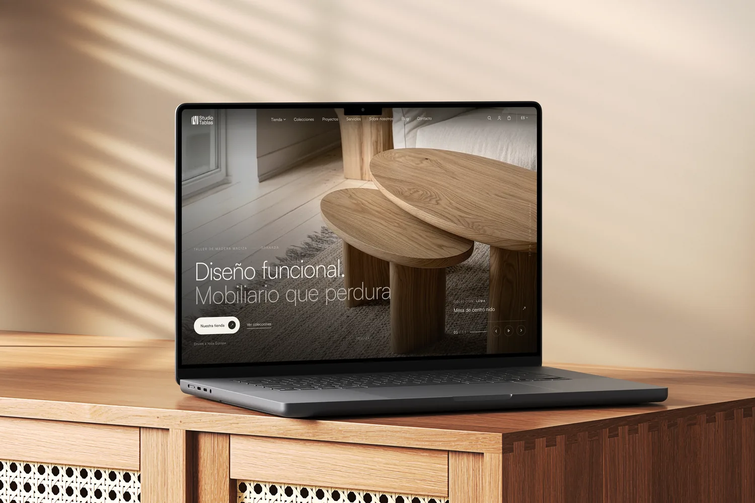
Today I do three things that, to me, are really one: I design a brand's identity, build its website in WordPress and review its SEO so Google understands it and shows it. I'm also creative director at Studio Tablas, a solid wood furniture workshop here in Granada.
This is the blog's first article, and it seemed fair to start at home: to tell you who I am and how I designed the website you're reading this on.
Why a new website
The old website had outgrown itself. It showed projects, but didn't explain well what I offer or how I work, and SEO, one of my services, didn't even have its own page. The cobbler's children go barefoot.
So I started where I start with any client: with the structure, before the design.
Architecture first
Before drawing a single screen, I defined what each page had to do. The idea is simple:
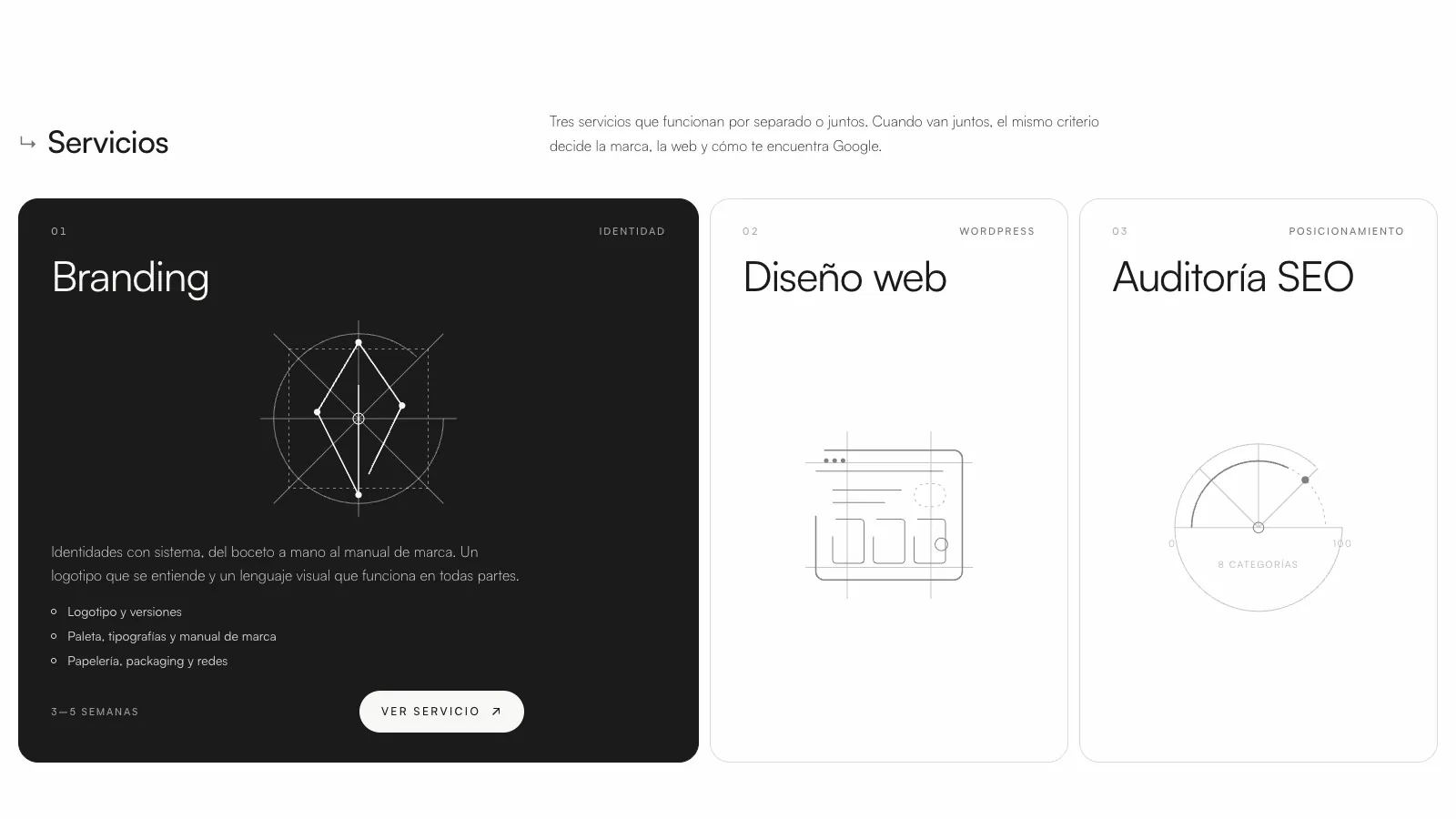
- Services sell. Branding, web design and SEO audit each have their own page, built to show up on Google.
- Projects prove it. Each case study tells the concept, the sketch and the result, and links to the service that made it possible.
- The home page routes. It doesn't try to say everything: it introduces the studio and takes you to what you're looking for.
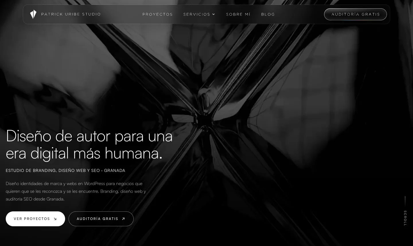
The menu went from eight items to four plus a button: Projects, Services, About, Blog and “Free audit”.
A visual world of its own
I wanted the website to look like the way I work: understated, precise and with details you discover little by little. These are the decisions behind it:
- Off-white and black. No accent colours: the colour comes from the clients' projects.
- Two typefaces. Satoshi for reading and Gotham Light for the logo and the menu, in spaced capitals.
- Construction diagrams. Circles, axes and points, like the ones I use when sketching a logo, appear in the services and on “About”.
- The ↳ arrow. It marks each section, like a note in the margin of a notebook.
- Motion with intent. A loading screen with a percentage, a headline that writes itself, a liquid-glass button and a 3D carousel with the logofolio sketches.
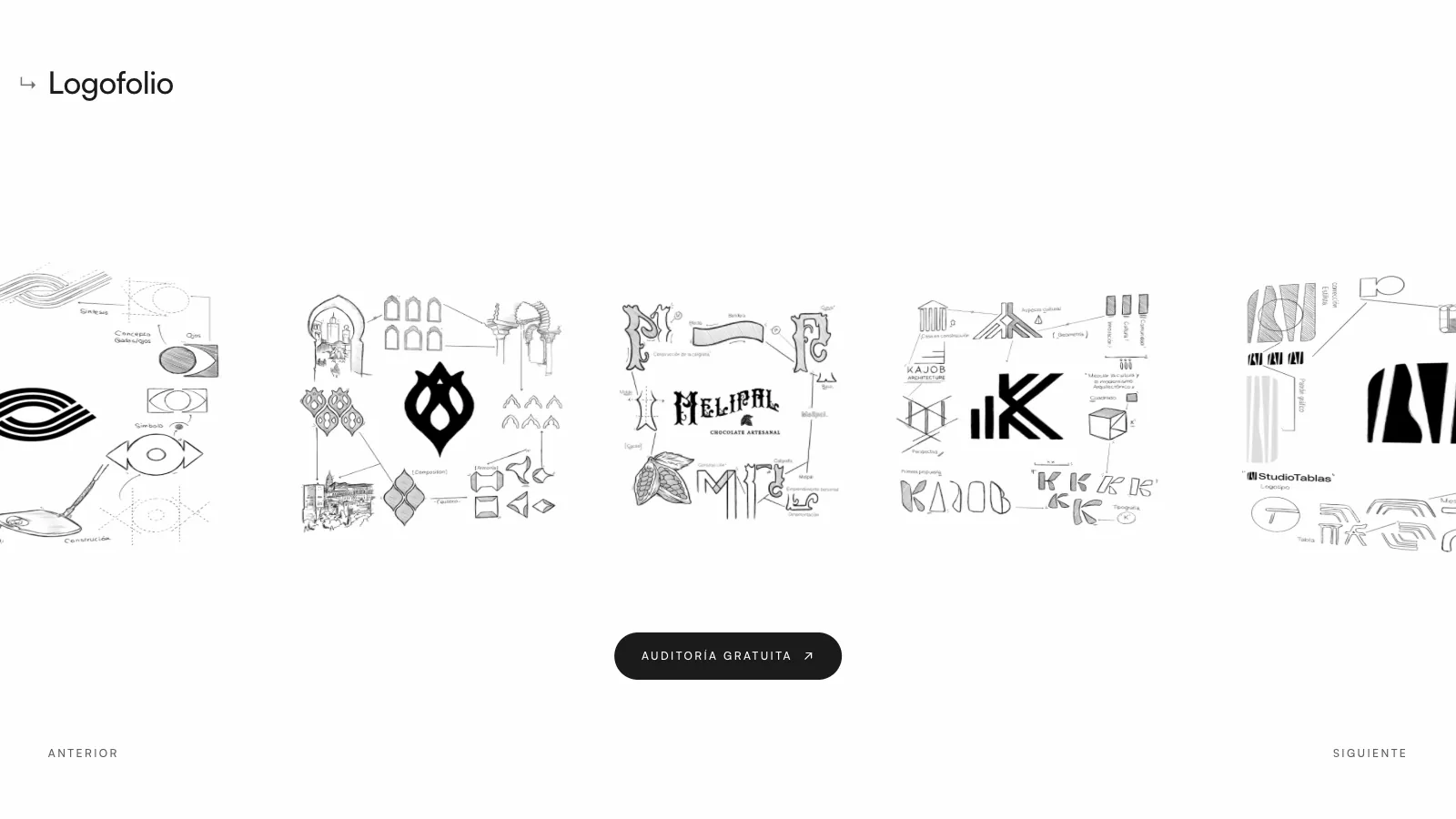
A logo isn't a pretty shape. It's the most compressed form possible of what a company wants to say about itself.
Projects, told properly
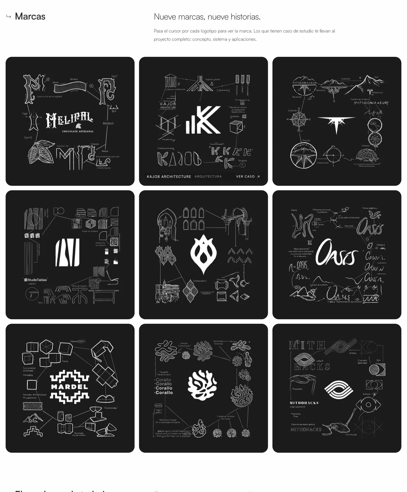
Each case study follows the same order: the cover, the client and the type of project, the logo concept (the map of ideas the brand grows from) and then the system: colour, pattern, applications and, when there is one, video. You can see it in Melipal, Patagonia Punto Sur, Kajob Architecture or Granada Basket.
And the logofolio holds the sketches just as they are: lines, corrections and constructions before the brands became brands.
Built for mobile and for Google
Designing something beautiful isn't enough if the website is slow to load or doesn't show up in search. So, while I was building it:
- The home page video has a vertical version for mobile, and went from 16.7 MB to under 2.5 MB.
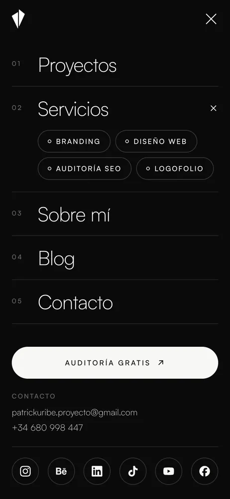
- The mobile menu is a full screen with every section, the contact details and social links one tap away.
- Every page has a title, a description and structured data so Google understands what it is: a service, a case study or an FAQ.
The tools
The website is built in WordPress with Elementor and my own code blocks for the more special parts. The sketches, as always, by hand; the design in Illustrator and Figma; and I've used artificial intelligence tools to code some pieces, with the judgement and design decisions always in my hands.
What's next
This blog will talk about what I do every day: how a logo is born, what an SEO audit checks, how to choose between a custom website and a template, and real case studies told without filters. If you have a question about your brand or your website, write to me: the answer might end up being the next article.
Thanks for reading this far. And if you're thinking about refreshing your brand or your website, we start with a free audit.