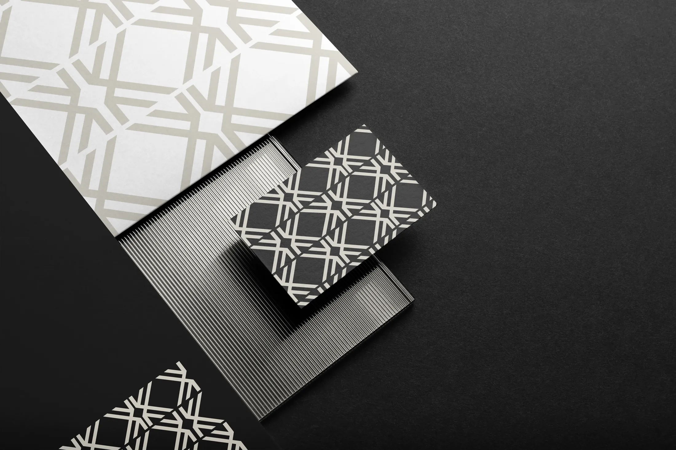
Kajob Architecture Brand identity for an architecture studio
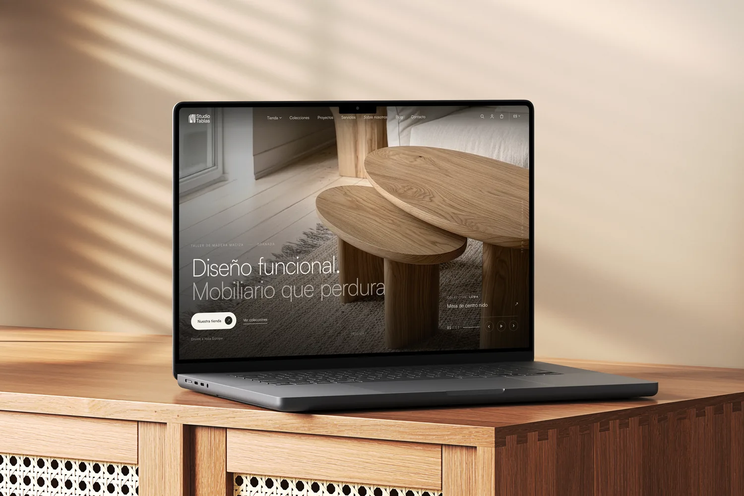
Kajob is the brand of Parfait Kamaha Deutchui, an emerging architect who loves designing buildings and spaces that improve people's lives. I designed a visual identity for architecture that reflects his approach (tradition, innovation and community), designed first for Instagram and Facebook while the website is on its way.
- ClientParfait Kamaha Deutchui
- Year2023
- Project typeBranding for architecture
- ServicesVisual identity · Pattern · Stationery · Social media
01Logo concept
Culture and modernism: a K built like a building.
The sketch brings together a house under construction, the cultural side and geometry. The note that sums it up: “mix culture with architectural modernism”. The K comes from the square and the cube; the bars come from the three pillars. A logo design built the same way as an architecture project.
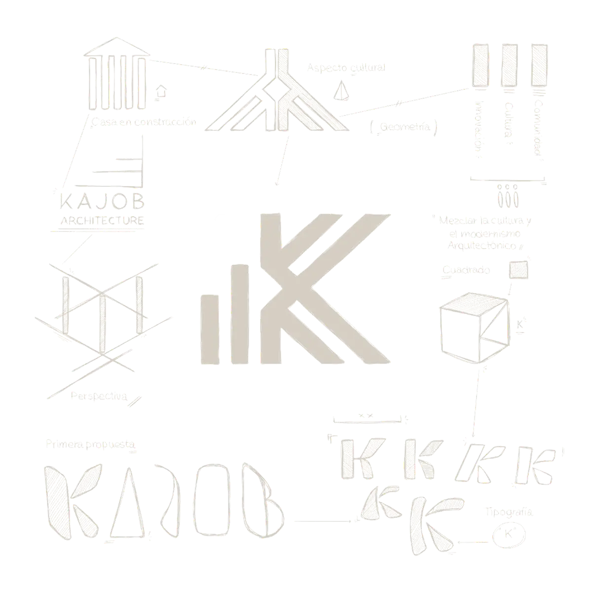
- CultureThe idea behind the sketch: mixing culture with architectural modernism.
- CommunityThe gabled roof holds community and tradition.
- GeometryThe K comes from the square and the cube; the bars from the three pillars.
- PerspectiveThe sketch works the K in three dimensions, like a house under construction.
02Symbol and construction
Three bars and a K.
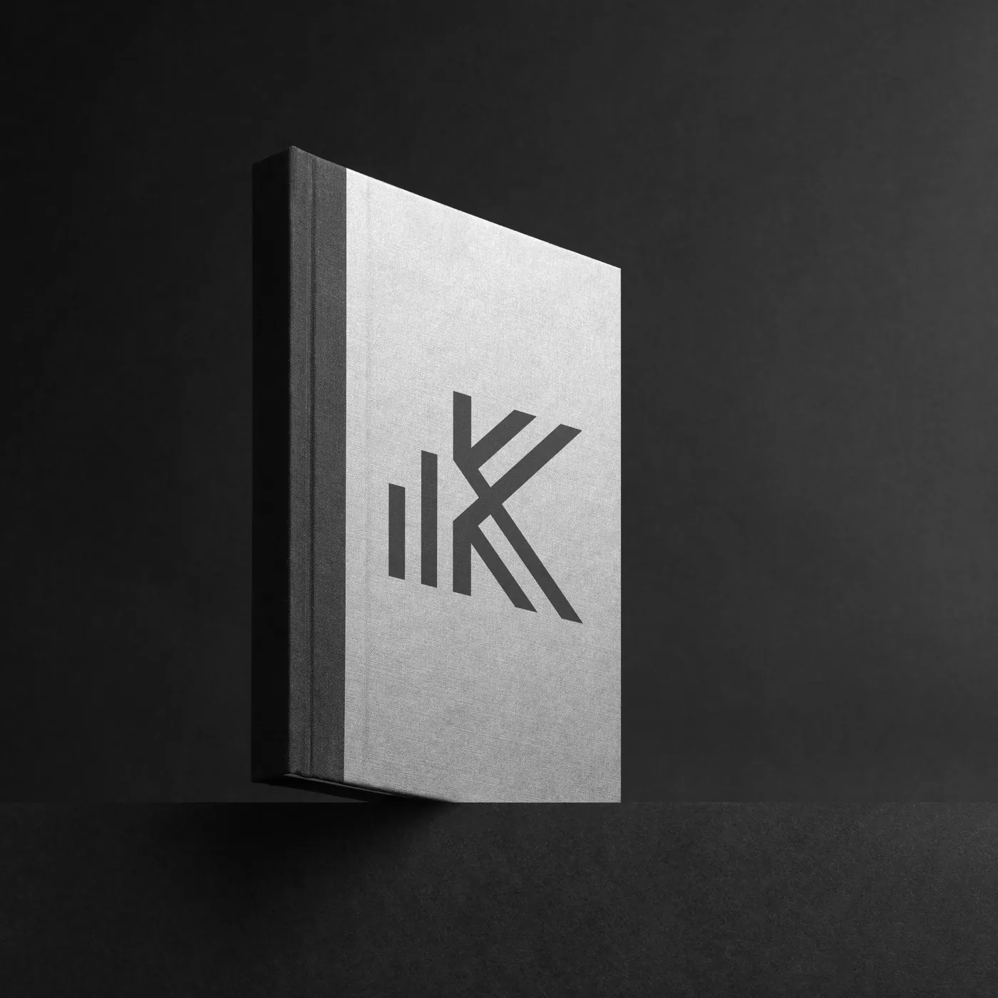
The logo is a typographic construction of the letter K, made geometric for a cleaner synthesis. The roof holds community and tradition; the columns, the house under construction; the three bars, rising like a building, stand for innovation, culture and community. Everything converges in the K.
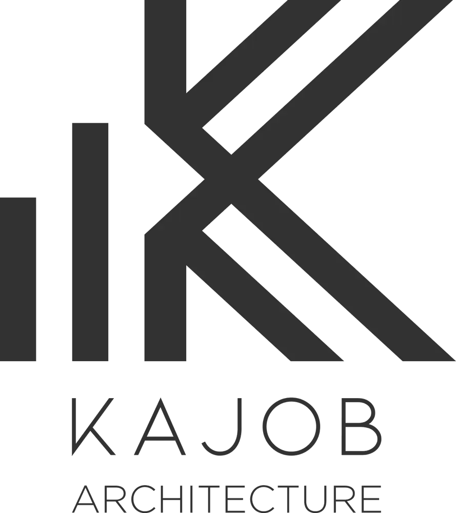
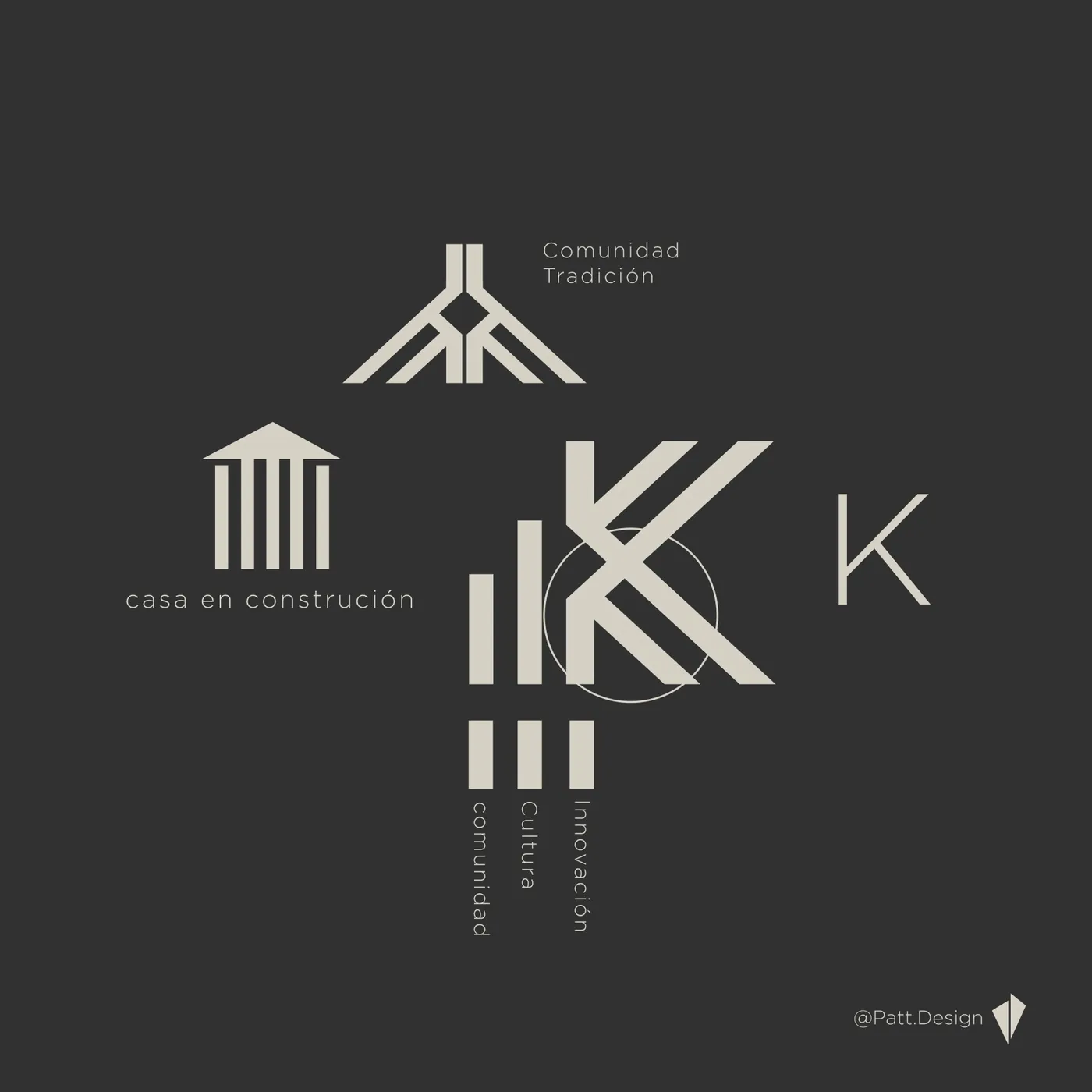
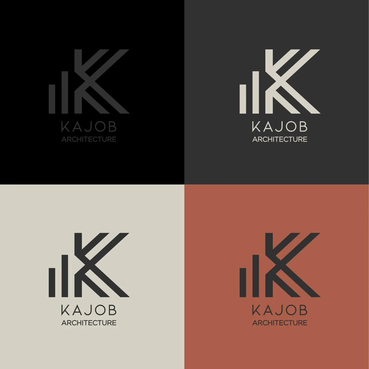
The logo on the palette's four base colours: black, graphite, stone and terracotta.
03Colour
A warm, refined palette that speaks of sustainability and eco-friendly materials.
RGB 0 0 0
RGB 50 50 50
RGB 173 165 156
RGB 214 209 198
RGB 171 94 74
MotionMovimiento
The K,
in motion.
Logo animation: the bars and strokes of the K build up into the full brand.
Animación del logotipo: las barras y los trazos de la K se construyen hasta formar la marca completa.
05Pattern and stationery
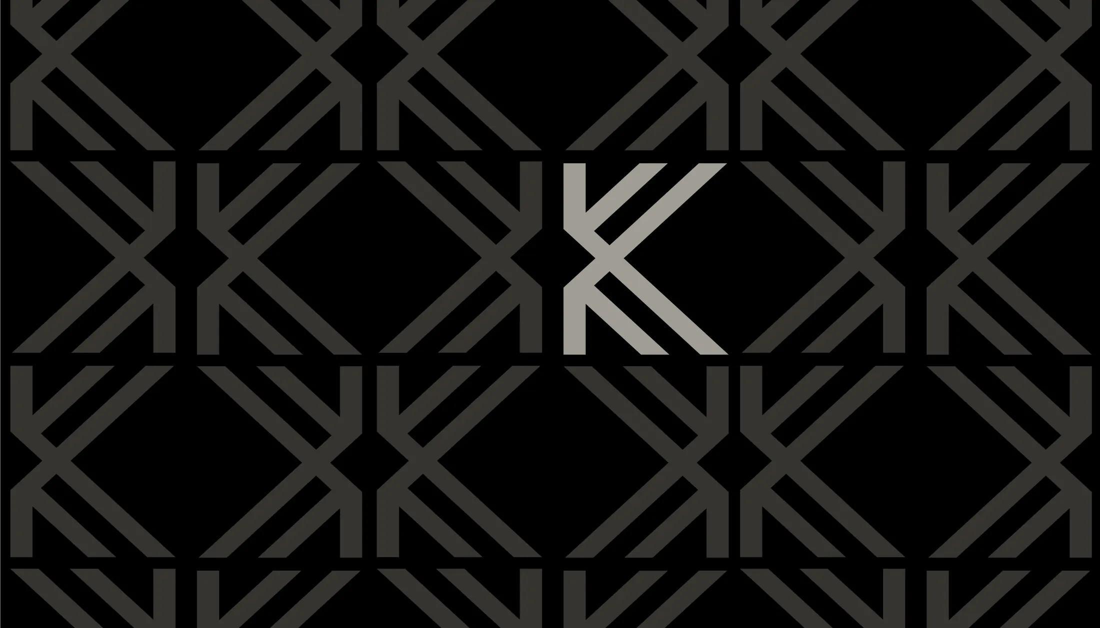
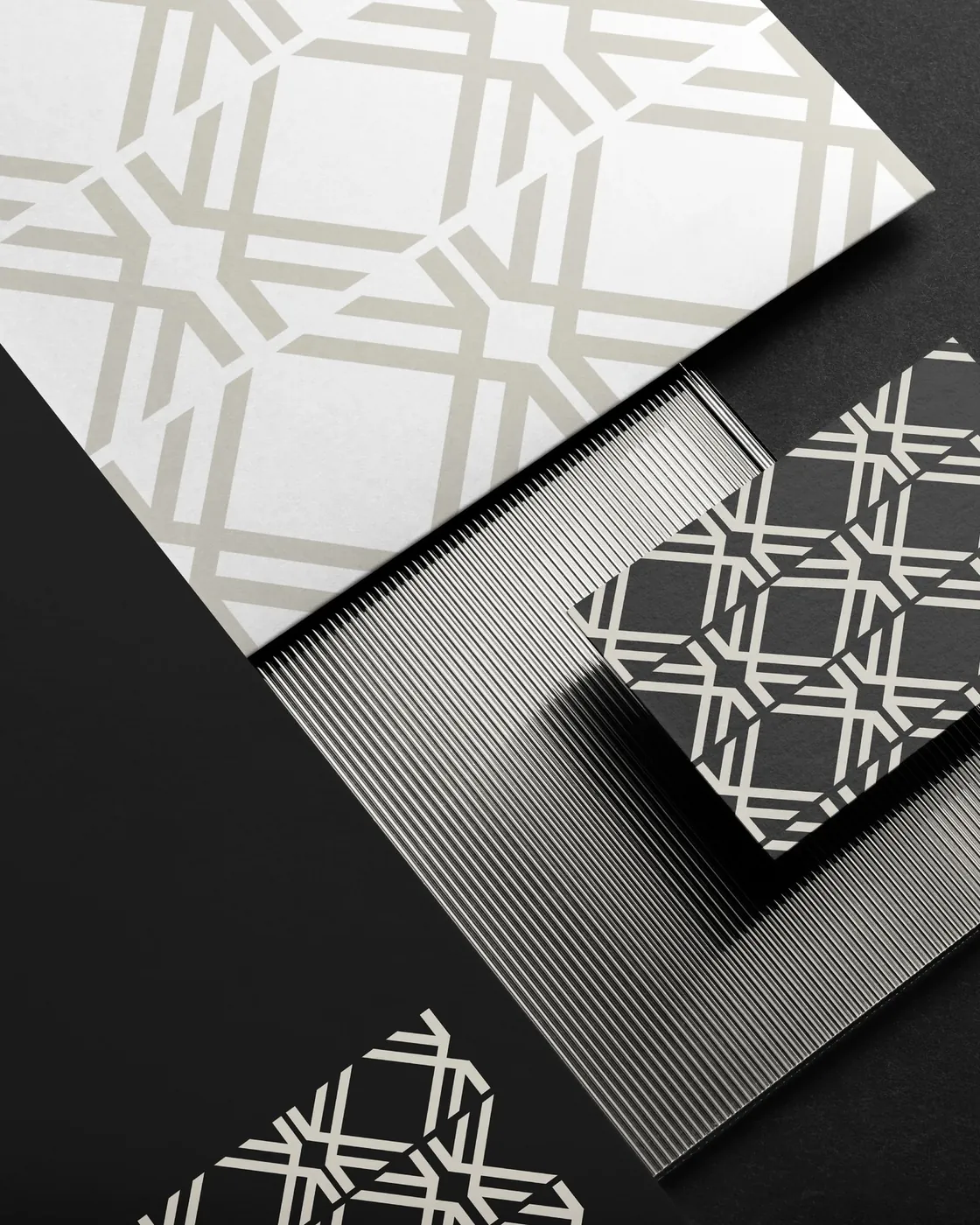
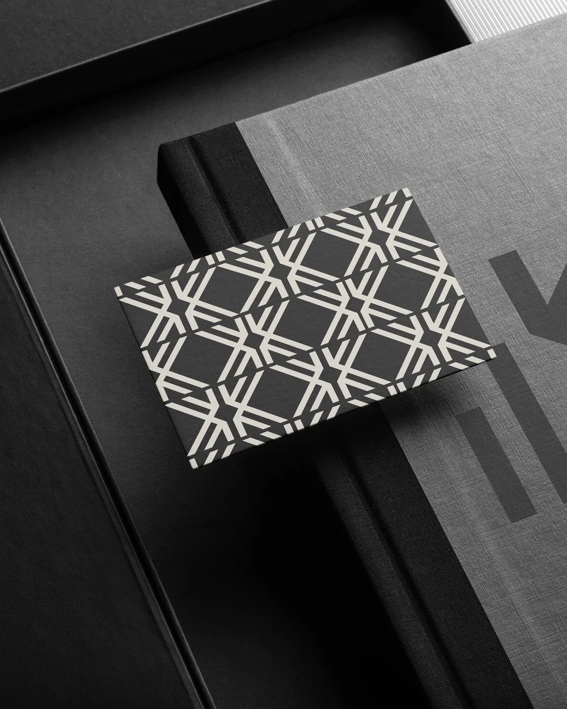
The repeated K forms a lattice.
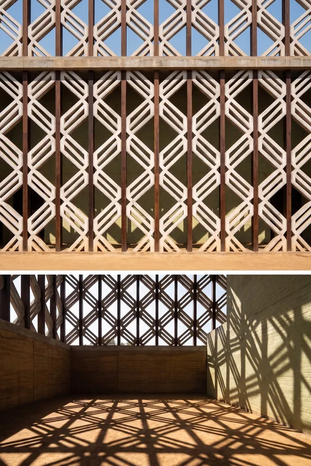
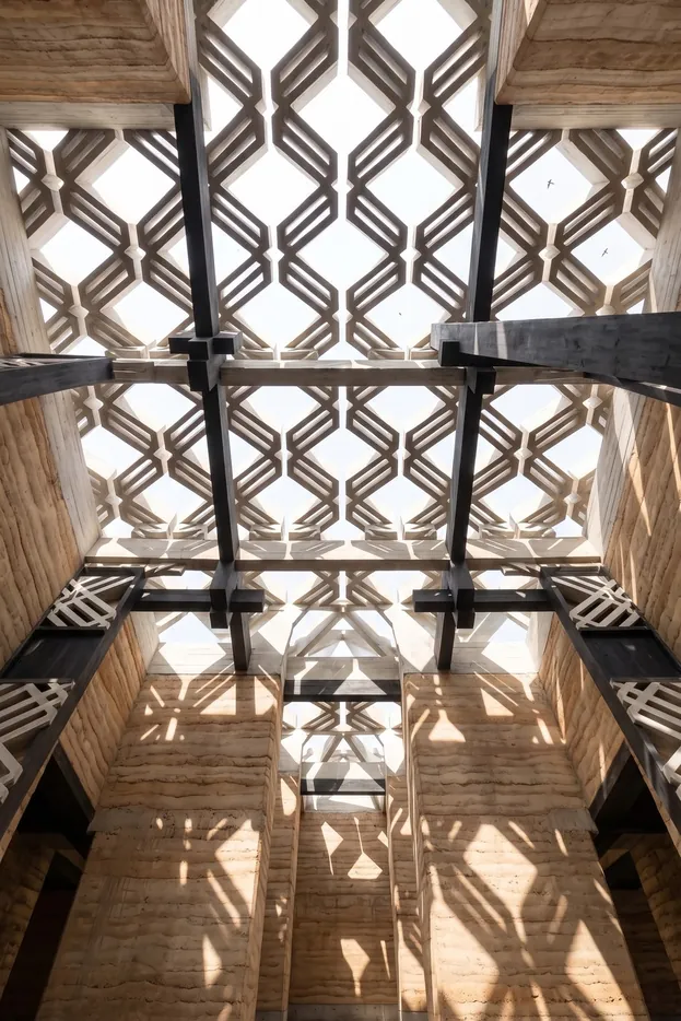
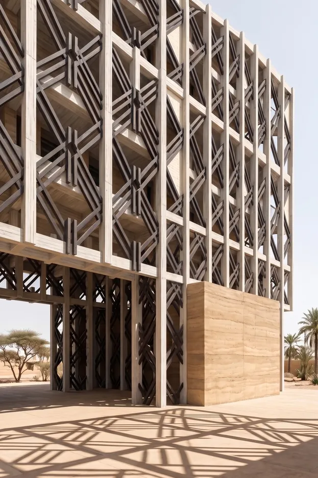
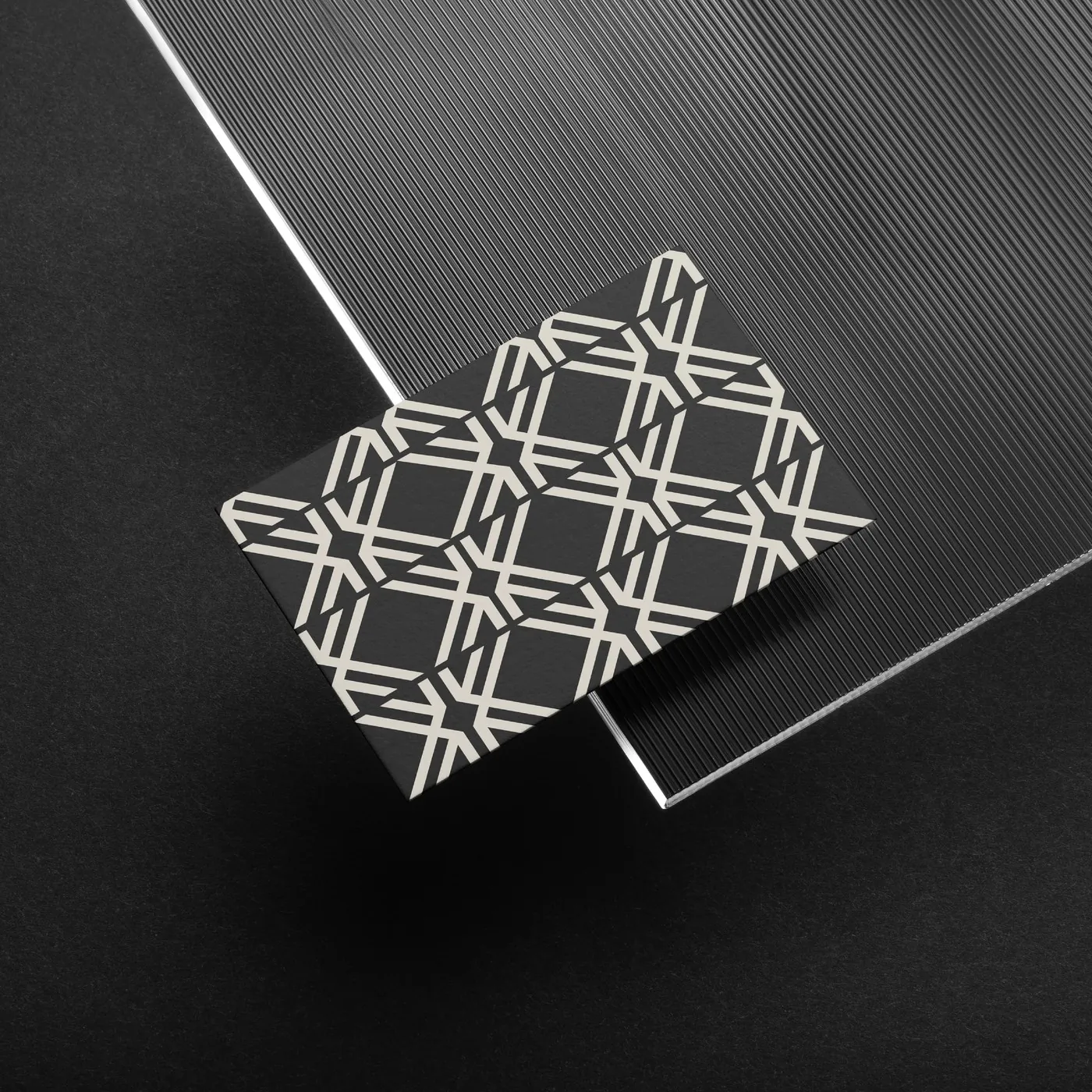
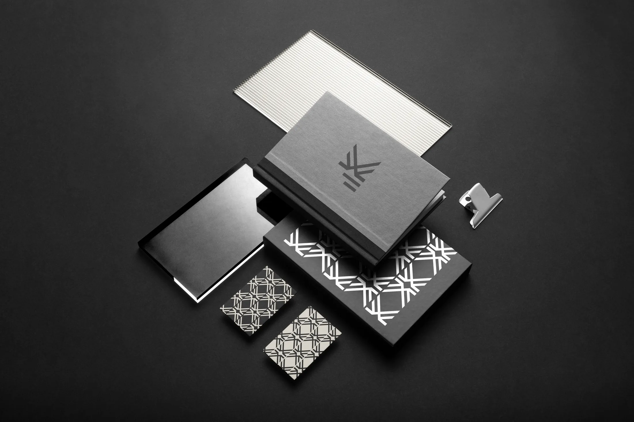
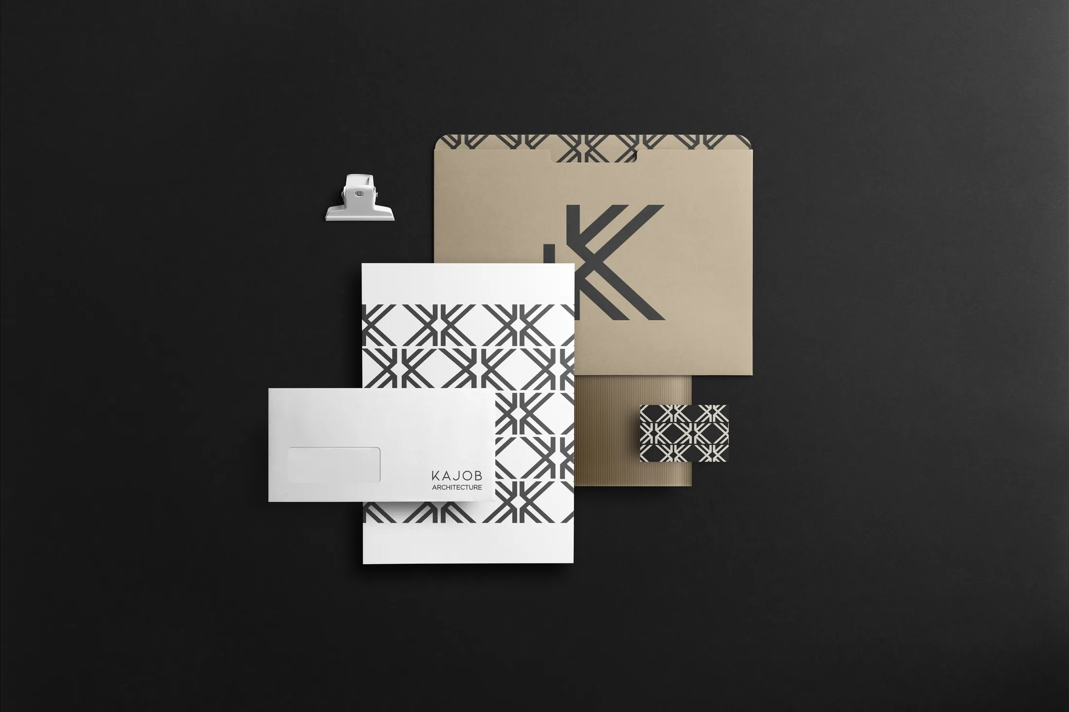
The symbol repeats until it becomes a pattern reminiscent of the lattices of traditional architecture. It dresses the business stationery (cards, folders and notebooks) and gives the brand a resource of its own, recognisable even without the logo.
MotionMovimiento
The pattern,
in motion.
Brand reel: the K lattice in spaces full of light, and the stationery. AI-generated architecture images.
Reel de la marca: la celosía de K en espacios de luz y la papelería. Imágenes de arquitectura generadas con IA.
07Exploration
The pattern, turned into architecture.
The K pattern turned into a lattice: façades, courtyards and staircases where light draws the brand. A way of showing how branding for architecture can leave the page and reach the building.
AI-generated images